Jimmy Mulldoon is the founder of Partner Studio, Teacher at Shillington, and Collaborator at House of mockups. Read on to find out what inspires him, presenting your work, and his predictions for mockup trends.
You found graphic design, and made a "Career Change" later than most. Tell me about how you found your passion for design, and what was the impetus to change careers.
I'd always been inspired by different mediums of art and design. My uncle is an artist in Pearl Beach Sydney, I saw so much of his work in my Oma and Opa's house when I was younger and I was always trying to analyse what he was trying to communicate in his abstracted erotic works. I started playing around with the Adobe programs in High School to created camp posters, T-shirts, EDMs, and registration forms.
After school I got a job in construction and pursued other passions, but graphic design was always something that I did even though it wasn't a full-time job.
I did get to a point in my life where I knew I couldn't keep working my construction job. I enrolled myself in a night time graphic course, I got 3 years into my 4 year course before landing my first role at a wine startup. It was one of the best decisions I've made.
Where do you find your design inspiration?
The New York Times Magazine is a weekly source of inspiration when it comes to illustration, photography, type, and editorial layouts. They really challenge the "normal" conventions of a magazine that holds such important stories and information.
Photography is also a huge source of inspiration for me. I enjoy just wandering different streets of New York that I don't know to see what captures my attention. Getting lost on the subway is a huge source of inspo, you see a different part of the city, different people, different fashion, different conversations. In those moments when I don't have to be anyone, I'm able to relax and let the environment influence me. Art that's not found in galleries also challenges me when it comes to colors, forms, and stylistic approach.
Your work is always presented beautifully—even early in your career with your work for Vinomofo—you had a really strong focus on art direction. How did you become so focused on presentation, and how important do you think presenting your design work is?
I believe that presenting your work is just as important as your typesetting or color choice. It's an extension of the brand and your skills as a designer. My time at Vinomofo allowed me to experiment with different art direction styles, it was always evolving as the brand grew quickly. For the team, we believed that "we've always done it this way" was very dangerous and we always want to experiment and push the boundaries of presenting our work.

Sometimes it works and sometimes it didn't work, we worked roughly till we knew we had something strong. My art director Adam Trovarilli allowed me to experiment and challenge the brand Identity and how we were going to visually communicate our products. Kit Young taught me so much about photography and staging the shoots. We were never working with a large budget and time wasn't on our side like all start-ups, so working quickly was key.
How you present your work is a key part of the storytelling of a brand, it brings it to life and allows those looking at it to feel what you're trying to communicate visually.
Do you ever use mockups? What is important to look out for?
Mockups are amazing for projects when budgets don't allow for an art-directed shoot. The things to look out for is the quality of the mock-up, some can be quite messy once you get into the file or the size is too small for what you might need it for. Try to find mockups that make sense for your project. That could be location or country-based mockups.
We are obsessed with the raw, authentic art direction and how you presented your Quoted Magazine work. Tell us about that journey and inspiration to present your work in such a non-traditional way?
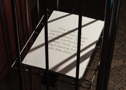
I spent some time planning for the shoot, I wanted to revisit the brief and what drove my direction inside the mag. I wanted to shoot the magazine with some iconic New York elements: Everything bagels, the 'pleased to serve you' coffee cups, Black coffee, and MTA cards. I ordered a vacuum sealer because I wanted to seal the bagels in with the magazines which I thought could work, lets say that idea didn't live on the site! The sealer did come in handy when it came to sealing the individual magazines off. Some times you just don't know how it's going to turn out until you do it!
I wanted the internal shots to really showcase the people's face behind the story. The iconic cover talks about the dark and light which cast the shadow and that really came to life once we went into the subway, you can't get any rawer than the New York subway.
You worked with House of Mockups collaborator Tim Seguin for Quoted Magazine. Tell us about the collaborative nature of a Designer and Photographer?
I've been a huge fan of Tim's work for many years and I was fortunate enough to work with him on this project. I came to the table with a look and feel that I wanted to capture for the shoot. Tim added some great ideas into the mix, we bounced ideas off each other throughout the shoot in the studio and outside.
The more conversations you have the more ideas you can produce. I believe it's super important to find a photographer that you trust and connect with creatively. I connect with his work and that's why I'll continue to work with Tim, He always works so hard for that shot that you have in mind.


What should we look out for as the next trend in Mockups and styling
Animation is going to start appearing within mockups. Brands are using animation to communicate their message over using a static image. It's really great at capturing your attention and if done right can tell you a story.
3D renders are appearing without us even know it, they're getting so realistic that it would be nearly impossible to know the difference between them and a real life shoot.
Any advice for designers on how to lift their presentation game?
Spend time planning out your shoot or how you're going to present that project layout. Remember no one knows the project as well as you, show it to someone you know will be able to provide feedback that could elevate it. The copy is another important factor in lifting a presentation, if it doesn't make sense people will move on. Planning out the presentation is something I still do, I sketch it out with all the content, photographer & animations to see how it's going to flow.
Present your work using some of Jimmy's Mockups here.


