Annette Dennis is the founder of Dossier Industries, Teacher at Shillington, and Collaborator at House of Mockups. She shares her journey into design and publishing as well has tips for presenting your work.
Tell us about your journey to becoming a Graphic Designer.
I first studied commercial screen printing, where the focus is on the technical production of prints. I kept asking the tutors if I could print my own designs instead of the supplied ones and eventually they let me use the equipment outside of class hours and suggested I might want to study graphic design instead.
I wasn't able to get into the Visual Communication course first time around so I did one year of a photography degree first. It felt inconvenient at the time but actually it has been a great skill to have, photography and design are very closely linked and being able to photograph my own design work and understand how to art direct shoots has really worked in my favour.

Where do you find your design inspiration?
Scrolling through instagram or tumblr is always tempting but for me there is nothing better than a physical sample, whether that is a type specimen, paper swatches, a book, a poster or a piece of packaging. I think I am often drawn to books as they are such a neat way to marry images, text and materials. Where possible I love going to talks and events, both online and in person, hearing other designers talk about their process and experiences in the industry can be really inspiring (and reassuring!).
How did you come to run your own independent experimental publishing imprint, Dossier Industries?
In 2017, my husband and I moved from London to Dallas, Texas. I had been traveling a lot for work prior to the move and found myself sitting on planes wondering what I would do in Texas as I was unsure of what the job market would be like. I had been working as a design director mostly in branding for years and felt it would be good to explore areas of graphic design that I hadn't been able to pursue previously. I had always been interested in art books and independent publishing so it seemed like a good time to start designing books. We relocated to Melbourne at the end of last year and it is getting busier, I recently redesigned the site with a publication launching in about a months time, and another lined up for early next year.

Do you ever use mockups? What is important to look out for?
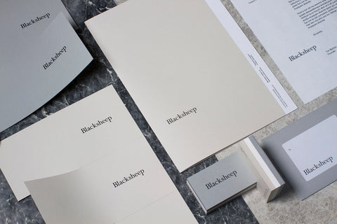
Yes, mockups are a great way to place your work in situ to help clients understand how the design will look in context. I always look for high quality mockups that have 'realness' rather than looking too manufactured or fake. I also think it's important to make sure the mockups are relevant and add value to your project case study.
What should we look out for as the next trend in Mockups and styling?
I'm waiting for the arrival of animated mockups as software technology continues to develop. Moving image is very seductive, particularly for non-designers so it seems natural that mockups will move into this area before too long. To produce really unique work, it's important to look beyond styling trends but instead to work on capturing what is authentic and relevant to the project.
Any advice for designers on how to lift their presentation game?
How a project is presented will have a big impact on how it is received, for better or worse. Be critical and spend the time really polishing your presentation so that your work can be viewed in the best possible light! Think about the best way to capture each element of the project, whether this is some key aspects of typesetting or the materiality of particular items.
Step up your portfolio with Annette's stunning Mockups here


