Hey trendsetters, welcome back to Letterform Luxe—your monthly fix for all things typeface chic! This time, we’re throwing some love at the sleek, modern world of geometric sans-serif fonts.
Clean lines, precise curves, and minimalist flair are back in the spotlight, and you better believe these fonts will level up your design game. Let’s dive into the sharp sophistication of geometric sans serifs and meet some serious font icons.
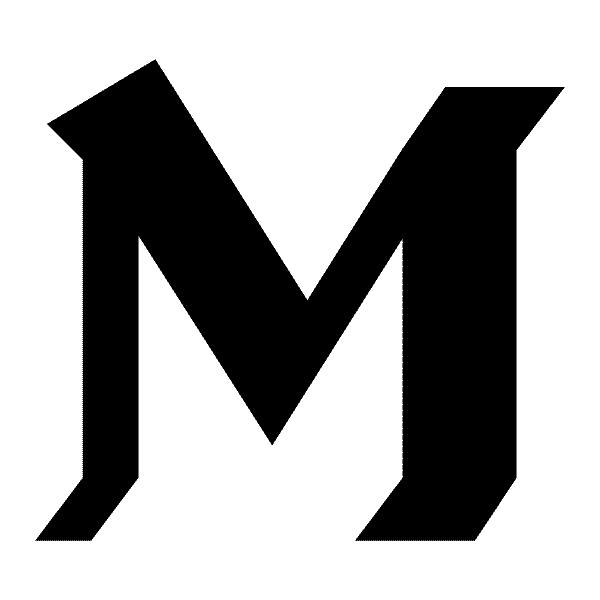
Design Institution

First up, let’s talk about the powerhouse font of the month—Design Institution by Want Studio, a bold geometric sans that takes minimalism and dials it up to 11. The clean lines and uniformity of this typeface make it perfect for everything from modern branding to editorial layouts. If you want a font that oozes professionalism but still feels fresh, this is your go-to.
Here’s where I put Design Institution to work: Cafecafe, a sleek and modern café brand featured in our Ultimate Café Brand Mockup Pack

The geometric sans gave the whole brand a cool, contemporary feel, perfect for a space that’s equal parts trendy and timeless.
Want to add some modern geometric vibes to your next project? Get Design Institution here!
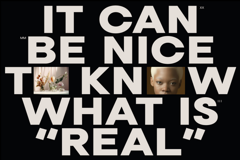
Neusa Neu Type Family

Next up is the Neusa Neu Type Family by Mariya Lish, and let me tell you, it’s serving serious Swiss minimalism vibes. Think clean and structured, yet flexible enough to handle both body text and headlines with ease. This font is perfect for creating a consistent, sharp brand experience across various platforms, whether you're working on editorial layouts or modern UI designs.
Check out Neusa Neu and see how this font can bring an edge to your projects with its meticulous geometric precision.
Brockmann


If you’re into modernism, Brockmann is your new best friend. Named after the legendary designer Josef Müller-Brockmann, this geometric sans-serif pays homage to Swiss design roots while still feeling cutting-edge. Brockmann thrives in poster designs, sleek websites, and anywhere you want a clean, no-nonsense look. It’s the definition of understated power.
Get ready to bring your next design to life with the precision of Brockmann—your secret weapon for creating sleek, modern layouts.
Franie Variable Geometric Sans Family


Meet the Franie Variable Geometric Sans Family, a super versatile font with 18 weights that let you customize the thickness and personality of your type. Franie is perfect if you need flexibility in your branding, where one project demands a light, airy look, and another calls for a bold, impactful headline. This font’s adaptability makes it an MVP in any designer’s toolkit.
Explore Franie Variable and discover how this geometric font family can add dynamic depth to your projects.
Why Geometric Sans-Serifs?
These fonts stand out because they’re the perfect mix of simplicity and boldness. Whether you’re working on tech branding, editorial spreads, or clean packaging, geometric sans-serifs bring a timeless appeal that’s always in fashion. Their structured shapes offer a modern, minimalist look while staying versatile enough for any project. And let’s be real, we all need a font that can go from “corporate chic” to “creative cool” without breaking a sweat.
Conclusion
This month’s geometric sans-serif picks are all about balance: simplicity with bold impact, modern style with timeless appeal. Whether you're diving into branding, UI design, or bold editorial layouts, these fonts will help you make a lasting impression.
Keep your eyes peeled—House of Mockups is always adding fresh, on-trend typefaces to our collection. Have a font or collab idea? Let’s connect!