For designers, 2020 has meant less time in the office, less face to face collaborating and endlessly juggling Slack channels to meet your deadlines. With more work being done at home, we have seen more designers using 3D mockups and PSD mockups to present their work.
In some cases, the mockups are making it into the real world as the finished product. This makes finding unique and and visually stunning mockups to present and sell your work even more important.
So let's get to it—the mockup trends of 2020—and the ones we think will stick around into 2021.
1. Floating Object Mockups
The Floating or suspended in motion trend has been around for a while, and was popularised by Japanese photographers in the 90's documenting everyday situations, like grocery shopping and playing piano with people levitating.
It has now made it way into the world of mockups, where products, packages and business cards are placed in an anti-gravity context, giving them a magical air of mystique. These surreal mockups are becoming popular and help a brand to stand out. Your brain needs time to process how it all works and thus helps to capture the views attention for longer on your brand and mockup
2. Hands and Bodies in Mockups

Since mockups started gaining mass popularity with designers over 10 years ago, hands and bodies have been left behind for minimal grey or white seamless backgrounds devoid of the human touch. The beauty sector was one of the few groups using people in their mockups and photography, but this was usually reserved for finished production and professional photographers and stylists.
2020 has seen an explosion of mockups that include human interaction, a touch that House of Mockups is excited to bring to its own mockup collection very soon.
3. Mockups with Shadows

Act + Acre Brandon Cabral
The mockups with shadows trend has been around for a while now. This mockup trend takes its inspiration from instagram, and usually uses natural shadows of plants, flowers and leaves to cast a shadow over our digital designs. It is a tactile and soft approach.
The best ones can make a cold digital file cast some emotion. Imagine an early Autumn breeze flowing in through a just opened window, the soft afternoon sunlight casting golden light and shadows over our designs. Sounds beautiful right? Unfortunately there are a raft of cheap and nasty shadow mockups out there. So be selective before spending any of your hard earned cash on these.
As with any mockup, it's important that the effect is enhancing your brand and working for you, not against you. Ask your self, is this palm leaf shadow really enhancing my work, or is it just time for a cocktail?
4. Gritty Authentic Mockups

Partner Studio Quoted Magazine
Enough of the polished, hyper reality mockups that dominate the designers mockup scene. House of Mockups is super inspired by the gritty real mood of real in-situ mockups.
House of Mockups exclusive partner Partner Studio brings us some incredible art direction with Quoted magazine. They show the no holds barred approach to authentic gritty scenes of life in the cites you live in. These Mockups maximize and embrace the reality that is around us. We want to see more of this style of work in 2021.
5. Isometric Mockups

Isometric Mockups have been a stable of Digital mockups for years now. The isometric perspective has been popular in showcasing your digital designs, websites, apps and branding, while giving them a more 3D appearance.
Isometrics had been feeling a bit dated, but 2020 has bought the isometric mockup style fulling back into fashion, incorporating it with a slick appearance, and stunning shadows. 2021 might just see the isometric mockup shine in a whole new way.
6. Flat Lay Minimal Mockups

Interactive Design Studio Branding by Selen Us
Flat lay minimal mockups say f*ck off to 3D, props, depth, isometric and all other kinds of design distractions. Apply this minimal mockup look to your own designs to make all of your Swiss design wet dreams come true . This pure, clean, slick and minimal approach allows your work to shine and will make the Müller-Brockmann Gods happy.
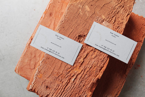
7. Mockups with Rocks, Bricks, and other Props

The Dot Home & Balin Manufacture
2020 has seen the proliferation of Designers presenting their work alongside natural materials. From randomly placed rocks, concrete, marble and terrazzo, right through to dried tree branches.
The forms can go from natural right to dramatic theatrical sculptures. And you know what? We love the additions giving these mockups life. As always we recommend that any props used add to the brand concept message you are trying to communicate in your design.
8. The Rise of the Mockup Podium

Mon Amande Macarons
9. Simple Vector Digital Mockups

10. Hand Painted Mockups
House of Mockups, Brooklyn Hand Painted Brick Wall Mockups
House of Mockups is excited to release its series of hand painted Brooklyn Billboard mockups. Inspired by the epic hand painted murals in Williamsburg and Brooklyn, they bring the belief that quick and easy isnt good enough to life. Bring your designs a sense of reality and authenticity in a mockup that show talent, commitment and persistence to create a premium product.
Find all of your unique and premium mockups at House of Mockups


